In this article, we will be reviewing a network troubleshooting tool called “PingPlotter”. Just like the name says, PingPlotter plots ping (and traceroute) data on a graph over a period of time.
The major difference between this tool and the ping/traceroute utilities is that PingPlotter comes with a sleek and stylish interface.
We will see this later in the article. For now, let’s get some definitions and technical points out of the way.
Ping
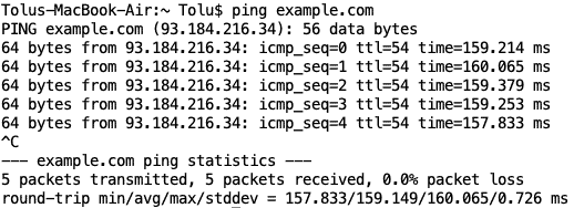
Ping is one of the most important tools for monitoring and troubleshooting a network. Basically, it answers the question, “Is this destination host available/alive?”. It also provides answers to two other questions:
- How long did it take to get to that destination and back (round-trip time, RTT)?
- How many, if any, packets were lost along the way?
Traceroute
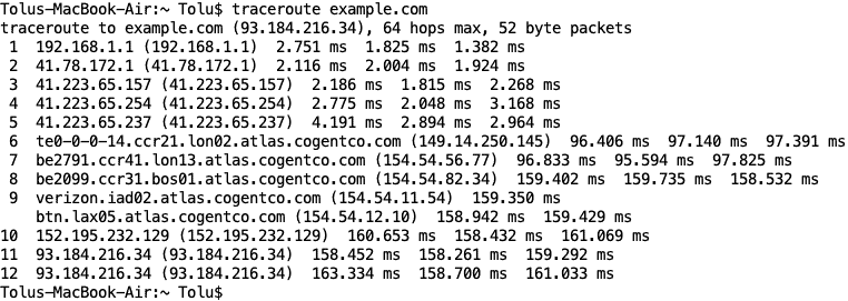
Traceroute provides information about the path to get to a destination i.e. the hops (or devices) along the path from sender to destination.
So while ping will only tell you whether a destination is alive or not, traceroute can provide added information about issues on the path.
Warning: Ping and Traceroute should not be considered 100% accurate. Various things (e.g. filtering, firewalls) may prevent them from working correctly.
PingPlotter – Review & Features
Now, enter the world of PingPlotter.
Like we already mentioned, it is a tool that combines the features of ping and traceroute (along with other features) in a nice interface and is a great ping monitor for your devices. It is supported on Windows OS, macOS, and iOS.
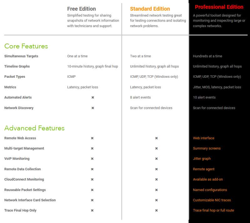
PingPlotter comes in three different editions:
- Free!
- Standard, and
- Professional.
It can be downloaded here and gives you a 14-day free trial on the Professional edition.
You can visit this link to compare the features available on the different editions – You can also see them below:
Note: In this article, we will be running the Professional Edition based on the 14-day free trial. We will also be using a macOS even though the one for Windows will be broadly the same.
Installation
Installing PingPlotter is pretty straightforward. All you need is to download the appropriate installation file and install it like you would any other application. For macOS, you have the option of moving it to your ‘Applications' directory.
Running a Trace
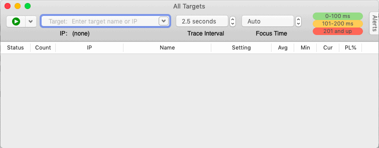
Even if you don’t read any documentation, you probably know to enter the target IP address/hostname in the box provided and click on the GREEN BUTTON to start the “plotter”.
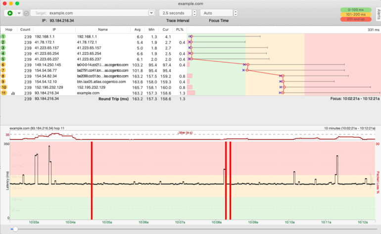
For this article, I ran a trace to “example.com” over a period of 5 hours. Let’s take a look at the output:
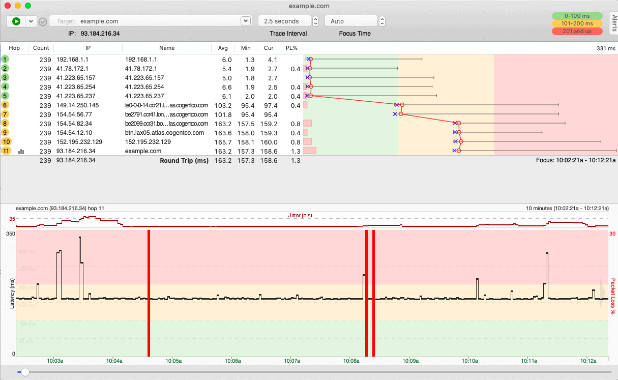
Below you'll find a description of what each section of PingPlotter does and how to interpret the data that it gathers for the connection your testing.
Interface
Target Bar

This is where you configure your setup and it contains the following:
- Buttons to run, pause, restart, or cancel a trace operation
- A field to specify the target IP address/hostname
- The Trace Interval which determines how frequently PingPlotter send test packets
- The Focus Time (which we will discuss later)
- The intervals to use when displaying response times. For example, my default setting considers response time (RTT) between 0 and 100 ms as good (GREEN), 101 and 200 ms as just okay/not so good (ORANGE), and 201+ ms as bad (RED). You can adjust these settings as is relevant to your case (like in my case where my Internet connection is not great).
Trace Graph

This part of the interface looks very similar to what you get when you run Traceroute. Basically, it provides all the hops along the path from source (the computer running PingPlotter) to target, the response times for each of those hops, and if any packet was lost for each hop.
Note: Packet loss is normal on a network, especially one that is shared by many users. The problem is when there are too many lost packets.
The colorful part of the Trace Graph (called the “Latency Graph) just plots the response times and packet loss in a nice looking graph.
The colors are based on the intervals you configured in the Target Bar above. There are also some icons used in this graph that are worth talking about. Consider the image below:
![]()
- The H-looking line represents the range of the response times i.e. minimum to maximum response time for a particular hop
- The blue X represents the response time for the last packet sent
- The red O represents the average response time
- The pink rectangle represents the percentage packet loss
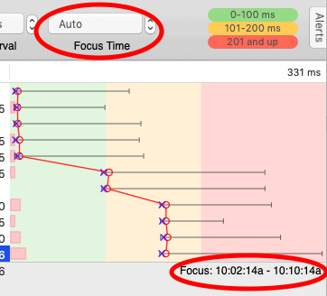
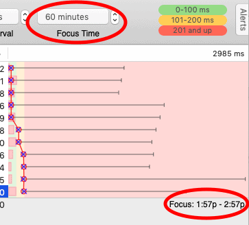
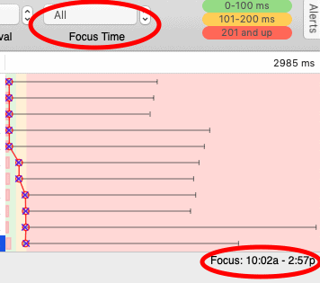
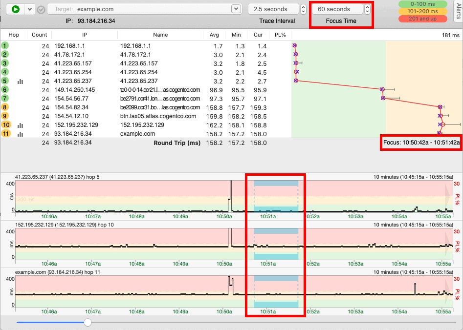
Keep in mind that the Trace Graph is affected by the “Focus Time” setting in the Target Bar. Leaving the default setting of “Auto” for the Focus Time, the Trace Graph will display data for the current focus in the Timeline Graphs (discussed next). However, we can change this value to view data for different ranges e.g. 5 seconds, 60 minutes, All, etc.
Timeline Graphs
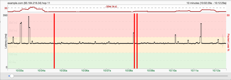
While the Trace Graph gives you a summary of your data, the Timeline Graph provides detailed information for each hop over the trace period.
- The black line (with highs and lows) is a representation of the response time. The scale labeled “Latency (ms)” on the left provides a reference for reading the response time in milliseconds.
- The red vertical lines represent packet loss. The scale labeled “Packet Loss %” on the right provides a reference for reading the packet loss.
- In the Professional Edition, there’s also a line representing Jitter (variation in delay) at the top of the graph.
By default, only a Timeline Graph for the target host is displayed in intervals of 10 minutes. You can use the scrollbar at the bottom (or click and drag the graph) to look through the entire timeline.
You can add more timeline graphs for other hops by double-clicking on the hop in the Trace Graph:

You can also change the displayed interval by right-clicking anywhere on the timeline graph and choosing the new interval:
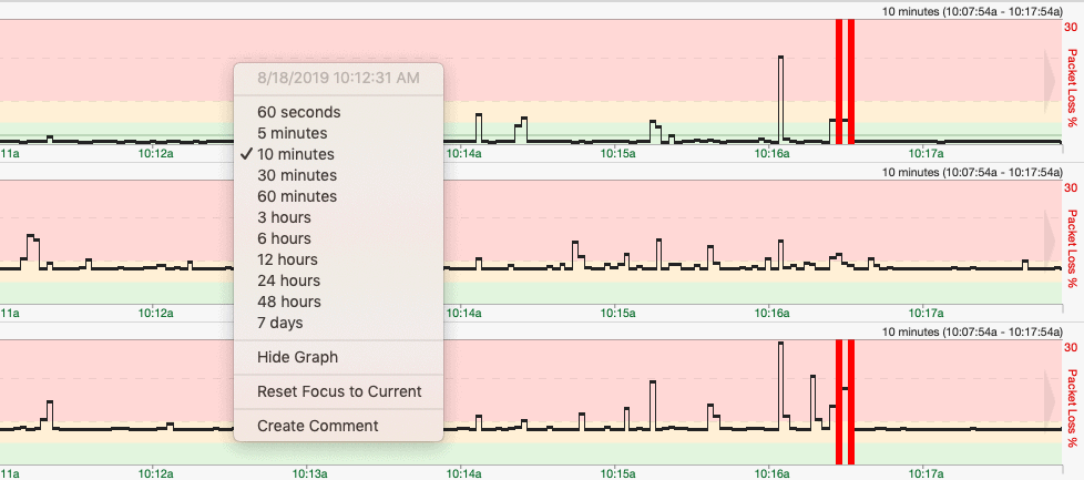
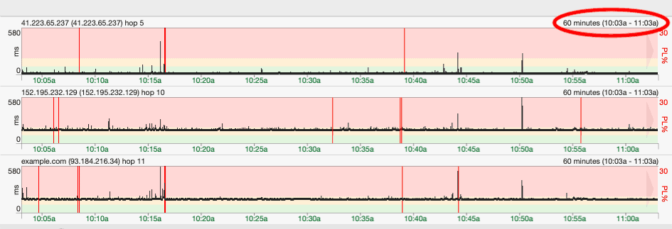
Along with the “Focus Time” setting, you can also double-click on any area of the Timeline Graph to focus on that area which will then affect the Trace Graph:
Making sense of the Data
Now that we have seen how to run a trace using PingPlotter and also the different parts of the interface, how do we make sense of all these data?
PingPlotter is a Tool that Presents Latency and Packet Loss data to the user and thereafter, the analysis is up to you to Troubleshoot your network to pinpoint the exact cause using the data they've provided.
Let us consider a Few Scenarios that PingPlotter can be used for:
- No Response from Target:
You may run a trace and not get any response from the target. While it is possible that the host is actually down, there may also be filtering or a firewall blocking the trace. On the Windows version of PingPlotter (using the Professional Edition), it is possible to switch from using ICMP to TCP or UDP which have a lower probability of being blocked by a firewall/filtering. - High Response Time:
Imagine if you are trying to access a web service but the response is very slow. Using PingPlotter, you may be able to figure out where the problem is coming from: your end, your ISP, or the web server itself. - Packet Loss:
Since PingPlotter reports on Packet Loss, it can be very useful to determine not only that packets are being lost along the path, but also where packets are being lost. This can be due to network congestion, bad hardware, or even security attacks. - Network Congestion:
Running PingPlotter for a long time (e.g. 24 hours or even 1 week), you are able to determine the periods when the network is congested and plan around that. For example, during my 5-hour monitoring of “example.com”, I started downloading a large file which affected my response times (even though my average response time wasn’t affected much).


Fixing the Problem
The same way PingPlotter will not analyze data for you, it also can’t be used to solve any issues on the network. That part is still up to you.
However, one of the things I found most fascinating about PingPlotter is the level and amount of documentation available on their website.
For example, this article provides information about common network problems and how you can identify them from a PingPlotter trace. They even have options for specific issues such as Gaming, Streaming, and VoIP.
Other Important Features
Having discussed the main capability of PingPlotter, let us now highlight some other features available on this tool.
Sharing/Export Methods
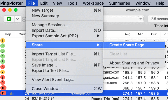
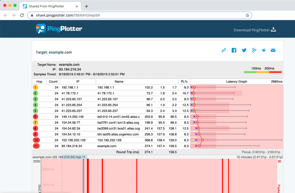
These include exporting as a PingPlotter (.pp2) file, exporting as a text file, and even creating a “Share Page” on the PingPlotter website with your own unique link.
Alerts
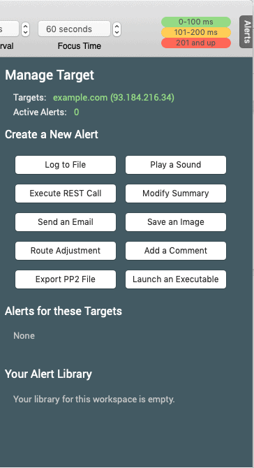
You can create various alerts for a target depending on a set of conditions. Alerts include logging to a file, playing a sound, sending an email, and so on.
Conditions include Network latency and packet loss over a certain time period, a route change along the path, and so on.
Local Network Discovery
Scan for local devices on your network and add them as targets to be traced.
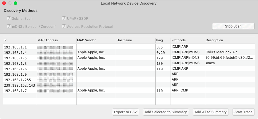
Note: It is not immediately clear if PingPlotter can discover devices on other subnets than the one on which PingPlotter is running. It seems not.
CloudConnect
This allows you to deploy agents on remote machines (which can run their own traces) and manage all these agents from one central PingPlotter machine. This is only available on the Professional Edition and as at the time of this writing, some parts are still in development.
PingPlotter vs. MTR Comparison
If you have ever heard about MTR, then you may be wondering, “How is PingPlotter different from MTR?” For those that don’t know what MTR is, it is a tool that combines the functionality of Ping and Traceroute into one.
You can use it to perform a one-off trace or to continuously monitor a target. It is free, supports various protocols including ICMP, TCP, and UDP, and is available for most operating systems including macOS and Windows.
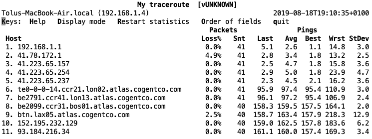
To be honest, when comparing basic functionality, the major differences between PingPlotter and MTR is the sleek graphical user interface and the extended export capabilities that PingPlotter has to offer, as well as sharing reports online now! If you like the graphing feature of PingPlotter and insist on using MTR, with enough skills, you can probably configure MTR to send its data to another application which can then create graphs from that data. Otherwise, Stick to Pingplotter, as it has all these features built into it already!
So do you still need PingPlotter given a free alternative? I guess the answer depends on your skill level:
- Skilled and Enterprise-level Network Administrators may prefer MTR (or even another monitoring solution entirely) to PingPlotter, unless you Enjoy the Easy to Read Interface and Color Coding – Then we Suggest you get a Pro License of Pingplotter, as its extremely useful in giving you trouleshooting data and allowing you to save and Export for later use.
- Home users and small-business administrators may like the ease and beauty of the PingPlotter interface over MTR as well.
* PingPlotter has a Free edition but with limitations, limitations that do not exist on MTR.
PingPlotter vs. Network Management Systems
The guys at PingPlotter are clear about what PingPlotter is and what it is NOT – and PingPlotter is not a Network Management System.
Yes, you can run traces to multiple targets but once you start reaching a number (according to the PingPlotter guys, “hundreds or thousands”), then PingPlotter is not the solution for you.
PingPlotter is a Great way to Get insights into Network, Bandwidth and Latency/Jitter issues visually. You can quickly pinpoint issues on the Graph and start troubleshooting there.
Conclusion
This brings us to the end of this article where we have looked at PingPlotter. This tool combines the functionality of the ping and traceroute into one and displays data on nice graphs.
PingPlotter can be used to “see inside” a network to identify problems like congestion, packet loss, and even device unavailability with an Easy to Use Interface to Pinpoint issues Quickly! However, it should be noted that this tool does not analyze or resolve issues on the network and it is also not a network management system.
PingPlotter has a Excellent GUI and if your inclined to use Visual Graphs over command line numbers, then PingPlotter is a great tool to have in your Arsenal. All in all, we definitely see the upside in using this tool in both Home and Enterprise environments if you need to troubleshoot networks and latency issues.
If you want to test it in your own Network, they have Windows and Mac OSX versions available to download for Free – Premium license is also available via their Website as well!
PingPlotter FAQs
What is PingPlotter?
PingPlotter is a network troubleshooting tool that uses traceroute, ping, and other diagnostic tests to identify and resolve network connectivity issues.
What operating systems does PingPlotter support?
PingPlotter is available for Windows, macOS, and iOS.
What are the key features of PingPlotter?
The key features of PingPlotter include real-time network performance monitoring, automated alerts and notifications, detailed network diagnostics, and customizable charts and reports.
How does PingPlotter work?
PingPlotter sends packets to a target IP address or domain name and records the latency, packet loss, and other diagnostic data at each hop along the network path. This data is then displayed in real-time charts and graphs for easy analysis and troubleshooting.
What kind of network issues can PingPlotter help with?
PingPlotter can help with a wide range of network issues, including connectivity problems, latency and packet loss issues, bandwidth bottlenecks, and DNS resolution issues.
How much does PingPlotter cost?
PingPlotter Standard is free to use, while PingPlotter Pro is available for purchase on a subscription basis, with pricing starting at $199 per year.
Can PingPlotter be integrated with other monitoring tools?
Yes, PingPlotter can be integrated with other monitoring tools such as Splunk, Nagios, and PRTG using APIs and other integration methods.

